Learning about UX from the air conditioner remote
Where does your design influence come from? Dribbble? Behance, maybe? Not me.
Recently I’ve been continually inspired by my air conditioning remote. In fact, again and again at work I keep referring back to the air conditioning remote like some sort of symbolic deity of design. Here it is:
 | 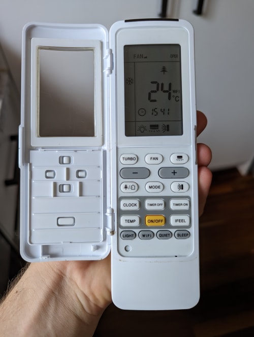 |
Let’s just appreciate the simplicity here. In it’s normal, closed position it’s a minimal and straighforward design. It displays all that’s needed and nothing more. Grandma friendly.
But, if you REALLY want to, you can always crack open the flap and fully customize your air conditioning experience.
The manufacturers are being honest with themselves here. They know that for most folks an air conditioner has 2 functions: Make it colder, and make it hotter. Anything else is a bonus.
I think designers and developers alike have a tendency to want to show off the cool functionality that they’ve spend time designing or developing - to put it on display. But it’s time’s like these that we need to be humble.
Being a product designer isn’t about being an artist, it’s about solving problems for your users.
If most users don’t give a hoot about your fancy functionality then it makes sense to add some strategic resistance on the pathway to that functionality. In other words…
Optimise for the most frequently travelled paths in your app.
When it comes to development my favourite HTML element for embracing air conditioning remote driven design are the details and summary tags. This power duo gives you the ability to hide away content that is of low importance or isn’t needed for the majority of your users. It’s an accorion. A collapsible. A foldy thingy.
You know, one of these
Surprise dog!The details and summary tags are just plain ol’ HTML - No javascript required baby!
A common use case is the advanced settings pattern. This pattern isn’t just useful for settings pages: once you recognise it as a pattern you’ll find uses for it everywhere. Typically it looks something like this (real life example from work):
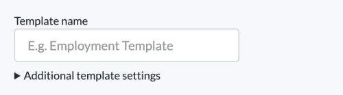
In this instance the only essential information we need is a name for the template, so in order to keep things simple for the user we’ve hidden the additional settings away behind the toggle. It’s not exactly glamourous, flashy design. But it’s the type of design problem that comes up daily on the job.
In conclusion, join my cult and worship the mighty air conditioning remote as your new design deity. Keep your interfaces simple on the surface, but powerful underneath. Oh, and subscribe for more stuff using the form below!
Comments:
No comments yet.
says...